Lauren Woodrick |

CSS grid really is something else. Gone are the days of meticulously wrangling floats and positions** With a little bit of planning, you can make layouts that are performant, but also have that fresh, art-directed feeling.
**I know flex is right over there — and they’re delightful — but this is a post about grid
If you’re looking to hone your skills in CSS grid but are drawing a blank on the application, why not take some inspiration from a classic master of the grid, Piet Mondrian? Fire up your favorite text editor and let’s get abstract. It’ll be like paint-by-number, but with easier cleanup. How can you go wrong?
If you’d like to get straight to the topic at hand and bypass setting up the “gallery” you’ll be hanging your grid painting in, feel free to fork this Codepen and go to town.
For the purposes of this tutorial, I was seeking a piece that had a reasonable number of color fields and used an even gutter (or gap).
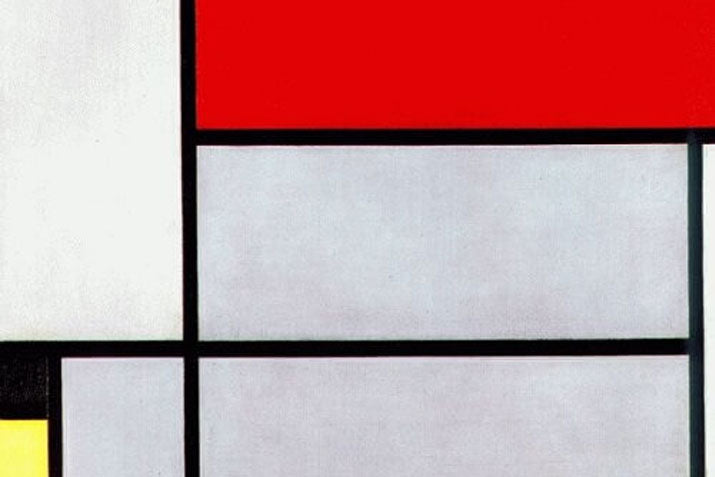
After browsing his work, I chose Tableau I (1921). There’s a straggler border at the bottom right corner, but we’ll work around that issue later.

First thing’s first, we’re going to set up our canvas and color palette using some handy CSS variables. Take your painting’s reference image, and input its dimensions as the --painting-width and --painting-height, then add a variable for each of the colors used in the painting.
:root {
  --painting-width: 312;
  --painting-height: 505;

  …

  --red: #e01f26;
  --yellow: #f7e646;
  --blue: #272662;
  --gray: #cecfd9;
  --white: #efefef;
  --black: #010101;
}
So, I fibbed a little earlier. It’s like paint-by-number… but where you also need to manufacture the canvas. Not the most thrilling part, but we’ll get through it together. Take your reference image into a graphics program, or take a screenshot in a browser extension like PixelZoomer.

Each of these sections, both the color fields and the black gutter, are going to form the basis for our grid system. Some of these columns and rows aren’t going to line up perfectly, but Mondrian was a human being, we won’t hold it against him. Just as I’m sure he wouldn’t be particularly disappointed that we’d make the composition slightly more uniform.
My reference image’s black gutters measure roughly 7px, so that’s what we’re going to apply to the grid’s gap property. I want my .painting to scale with its container, so I’m calculating the percentage of the width and height the gap occupies relative to those dimensions. Or rather, the calc() CSS function is.
.painting {
  width: 100%;
  height: 100%;
  display: grid;
  gap: calc(7 / var(--painting-height) * 100%)
       calc(7 / var(--painting-width) * 100%);
}
Next, we’ll set up the grid-template-rows and grid-template-columns. The row and column counts are going to be drawn from each horizontal and vertical segment, less the gutters. “But what about that black border segment?” We’re going to force that li’l guy to make an appearance by adding an additional row for it to appear before… but including no height. The neighboring yellow and gray fields will skip over him later.
.painting {
  …
  grid-template-rows:
    calc(32 / var(--painting-height) * 100%)
    calc(158 / var(--painting-height) * 100%)
    calc(85 / var(--painting-height) * 100%)
    calc(21 / var(--painting-height) * 100%)
    calc(75 / var(--painting-height) * 100%)
    calc(92 / var(--painting-height) * 100%)
    0%;
  grid-template-columns:
    calc(21 / var(--painting-width) * 100%)
    calc(52 / var(--painting-width) * 100%)
    calc(166 / var(--painting-width) * 100%)
    calc(39 / var(--painting-width) * 100%)
    calc(6 / var(--painting-width) * 100%);
}
If you’re lucky, all of these pixel values (plus the total width and height of their gutters) will add up to the width and height that you measured at the beginning respectively. If not, feel free to add a pixel here or there to reconcile the figures.
Now, the fun part — the actual painting. We’ll create elements for each of the fields of color, working from top-left to bottom-right to make each easier to track.
<div class="painting">
  <div class="black-1"></div>
  <div class="red-1"></div>
  <div class="white-1"></div>
  <div class="gray-1"></div>
  <div class="white-2"></div>
  <div class="black-2"></div>
  <div class="gray-2"></div>
  <div class="gray-3"></div>
  <div class="yellow-1"></div>
  <div class="white-3"></div>
  <div class="blue-1"></div>
</div>
I added some attribute selectors for color application like the following, but you can apply background-colors directly to the properties of your color field classes if you like.
div[class^="black-"] {
  background-color: var(--black);
}}
The exercise that comes next is specifying how many rows and columns each color fields span using the grid-area property. The values you enter for each is based on your starting and ending indices values as properties.

CSS grid starts indexing from 1, so for our first field of color, we’ll mark it as starting at row 1 and ending at row 2, and starting at column 1 and ending at column 3. We’ll continue on with the element order until…
.black-1 {
  grid-area: 1 / 1 / 2 / 3;
}
.red-1 {
  grid-area: 1 / 3 / 3 / 6;
}
.white-1 {
  grid-area: 2 / 1 / 4 / 3;
}
… we reach the final rows. Remember that row with a height of 0%? We’re going to specify the ending row for the .gray-2 and .yellow-1 elements as ending at row 8 so they skip over that final border, but it’s still applied to the remaining fields.
.gray-2 {
  grid-area: 4 / 2 / 8 / 3;
}
…
.yellow-1 {
  grid-area: 5 / 1 / 8 / 2;
}
And now, the finished product. With those last color fields cut to size, pat yourself on the back! You’ve emulated a masterpiece, and got to try your hand at setting up a layout using CSS grid.